BGRA Controls
BGRA Controls is a set of graphical UI elements that you can use with Lazarus LCL applications.
Support Us
If you like BGRAControls please support @circular17 with PayPal.
Installing
Use the Online Package Manager to get BGRABitmap and BGRAControls.
Notice that you must check only the packages “bgrabitmappack.lpk” and “bgracontrols.lpk” in the Online Package Manager. The other packages are optional and may need third party packages / libraries to work (OpenGL and PascalScript).
Optional Components
From v4.4 to v9.0.1.6, the components TBCDefaultThemeManager, TBCKeyboard and TBCNumericKeyboard were not registerd by default to allow Linux users to get a seamless installation with the Online Package Manager not installing third party stuff. From v9.0.1.7, as the necessary package is now part of Lazarus, these components are registered.
If you would like to include/exclude them from the package locally, you may turn on/off the “Register unit” in the package options for each file (bcdefaulthememanager.pas, bckeyboard.pas, bcnumerickeyboard.pas) then compile and rebuild Lazarus. On Linux you may need to install libxtst-dev and libgl-dev.
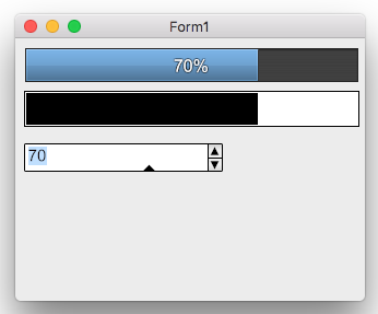
Screenshots macOS 64 Cocoa
TBCButton
A button control that can be styled through properties for each state like StateClicked, StateHover, StateNormal with settings like gradients, border and text with shadows. You can assign an already made style through the property AssignStyle.
Author: Dibo.
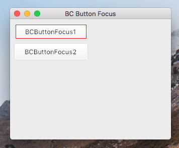
TBCButtonFocus
Like TBCButton but it supports focus like normal TButton.
Author: Dibo.
TBCGameGrid
A grid with custom width and height of items and any number of horizontal and vertical cells that can be drawn with BGRABitmap directly with the OnRenderControl event.
Author: Lainz.
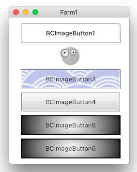
TBCImageButton
A button control that can be styled with one image file, containing the drawing for each state Normal, Hovered, Active and Disabled. It supports 9-slice scaling feature. It supports a nice fading animation that can be turned on.
Author: Lainz.
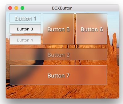
TBCXButton
A button control that can be styled by code with the OnRenderControl event. Or even better create your own child control inheriting from this class.
Author: Lainz.
TBCLabel
A label control that can be styled through properties, it supports shadow, custom borders and background.
Author: Dibo.
TBCRoundedImage
A Image Viewer which can show a resized image (even proportionally) or not and with different alignments, it can read both from a TPicture and from a TBGRABitmap.
Author: Lainz, Massimo Magnano.
TBCMaterialDesignButton
A button control that has an animation effect according to Google Material Design guidelines. It supports custom color for background and for the circle animation, also you can customize the shadow.
Author: Lainz.
TBCMDButton
A button control like TBCMaterialDesignButton, without shadow, but with more capabilities.
Author: Lainz. Contributions by Fritz.
TBCPanel
A panel control that can be styled through properties. You can assign an already made style through the property AssignStyle.
Author: Dibo.
TBCRadialProgressBar
A progress bar with radial style. You can set the color and text properties as you like.
Author: Lainz.
TBCSVGButton
Button made with SVG images for each state. Based on the SVG Viewer.
Author: Josh.
TBCSVGViewer
SVG viewer with several options.
Author: Lainz, Circular.
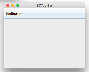
TBCToolBar
A TToolBar with an event OnRedraw to paint it using BGRABitmap. It supports also the default OnPaintButton to customize the buttons drawing. By default it comes with a Windows 7 like explorer toolbar style.
Author: Lainz.
TBCTrackBarUpdown
A control to input numeric values with works like a trackbar and a spinedit both in one control.
Author: Circular.
TBGRAFlashProgressBar
A progress bar inspired in the old Flash Player Setup for Windows progress dialog. You can change Colors and Style to Normal, MultiProgress (SubTotal and Total), Marquee (with or without Bounce effect), Timer (Countdown), Graph (as the details of Copy File). Also you can use the event OnRedraw to paint custom styles on it like text or override the entire default drawing.
Author: Circular, Massimo Magnano.
TBGRAGraphicControl
Is like a paintbox. You can draw with transparency with this control using the OnRedraw event.
Author: Circular.
TBGRAImageList
An image list that supports alpha in all supported platforms.
Author: Dibo, Massimo Magnano.
TBGRAImageManipulation
A tool to manipulate pictures, see the demo that shows all the capability that comes with it.
Author: Emerson Cavalcanti, Massimo Magnano .
TBGRAKnob
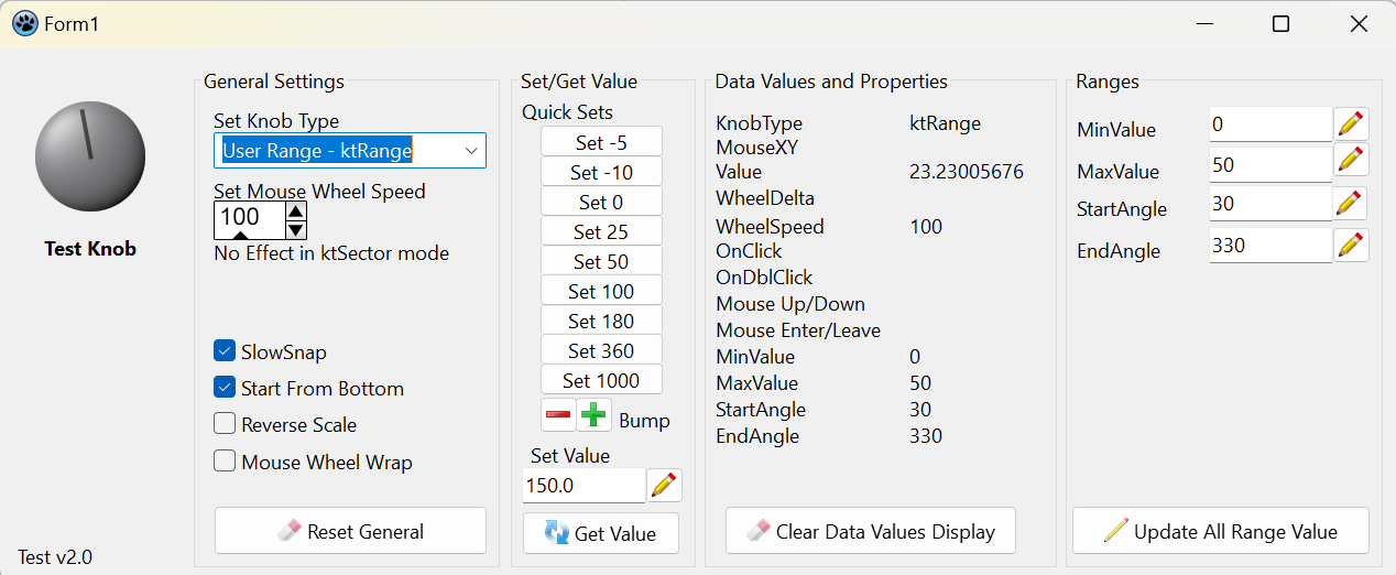 A knob that can be styled through properties.
Author: Circular, Sandy Ganz
TBGRAResizeSpeedButton
A speed button that can resize the glyph to fit in the entire control.
Author: Fox (helix2001).
TBGRAShape
A control with configurable shapes like polygon and ellipse that can be filled with gradients and can have custom borders and many other visual settings.
Author: Circular.
TBGRASpeedButton
A speed button that in GTK and GTK2 provides BGRABitmap powered transparency to the glyph.
Author: Dibo.
TBGRASpriteAnimation
A component that can be used as image viewer or animation viewer, supports the loading of gif files.
Author: Lainz.
TBGRAVirtualScreen
Is like a panel. You can draw this control using the OnRedraw event.
Author: Circular.
TBCNumericKeyboard
A panel with numeric buttons to store the input in a string. Then you can use the events to edit it to fit your needs and assign to other controls that value.
Author: Lainz.
TBCRealNumericKeyboard
A panel with numeric buttons to do the real input of the keys on keyboard. What you type is sent to the focused control directly.
Author: Lainz. Esvignolo.
TBCDefaultThemeManager
A component to style all the selected buttons in a form with the need to style only a single button. Can be used entirely with code.
Author: Lainz.
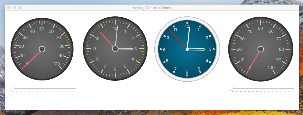
TDTAnalogClock
A clock.
Author: Digeo.
TDTAnalogGaugue
A gauge.
Author: Digeo.
TDTThemedClock
Another clock.
Author: Digeo.
TDTThemedGauge
Another gauge.
Author: Digeo.
TSuperGauge
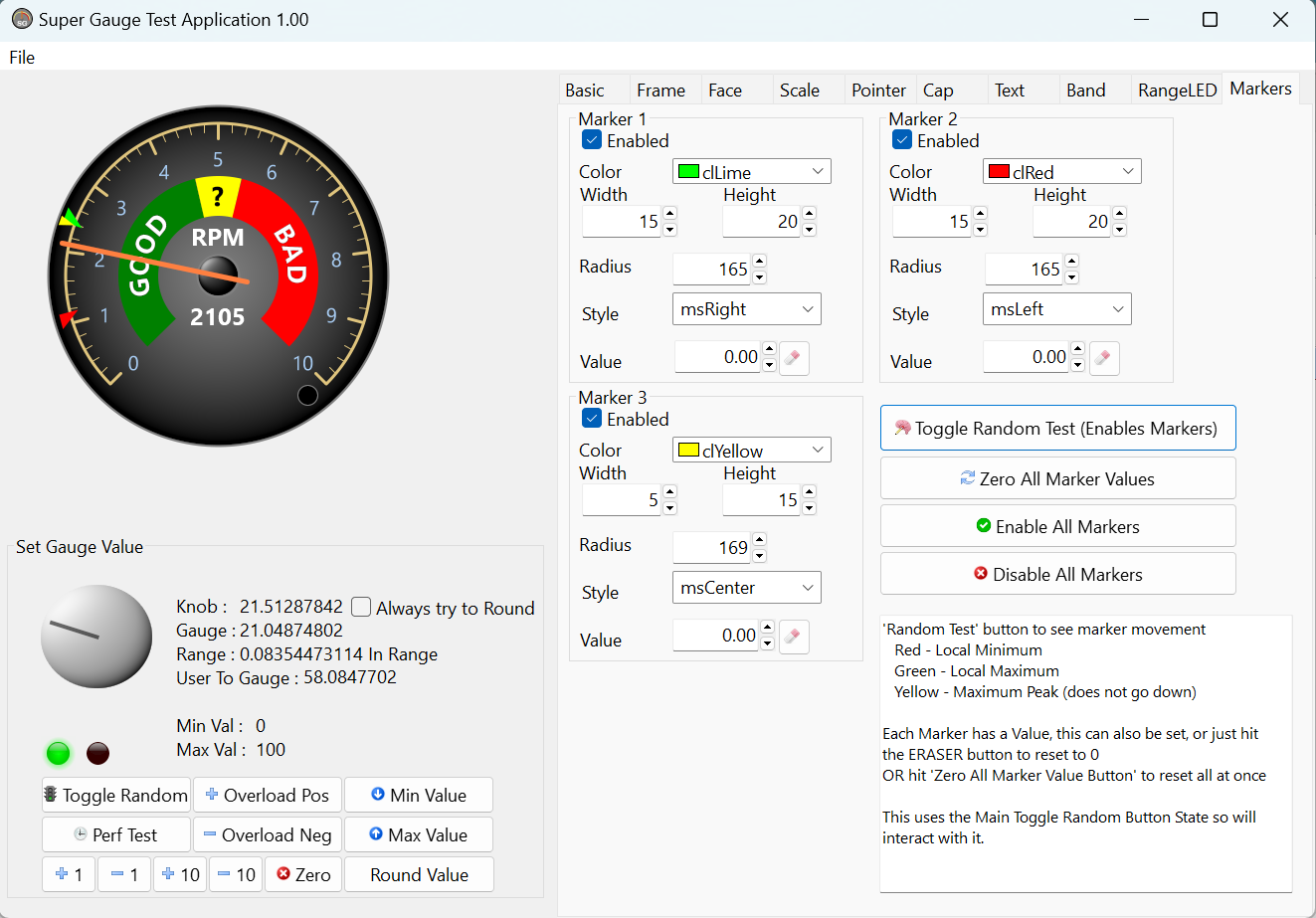 Updated and Enhanced Analog Gauge. Many new features, faster drawing, additonal events
Author: Sandy Ganz
TSuperSpinner
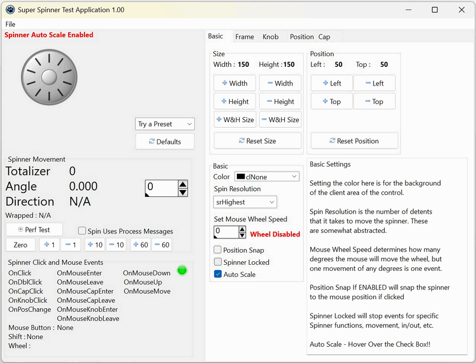 Spinner Knob, many visual settings and options, fast drawing, many supported events
Author: Sandy Ganz
TPSImport_BGRAPascalScript
A component to load BGRABitmap pascal script utilities.
Author: Lainz, Circular.
TBCFluentProgressRing
Progress control in a form of a circle. Also with animated indeterminated state.
Author: hedgehog.
TBCFluentSlider
Simple slider with modern design.
Author: hedgehog.
TBCLeaTheme
Non-visual theme-container that can be used with all the BCLea components. An editor, Theme Builder, is in the /test/test_bclea directory.
Author: Boban Spasic.
TBCLeaLED and TBCLeaQLED
Round and square LED controls. Can also be used as a switch (property clickable).
Author: Boban Spasic.
TBCLeaLCDDisplay
A LCD component with integrated font editor.
Author: Boban Spasic, Werner Pamler.
TBCLeaSelector
A knob to select between predefined items.
Author: Boban Spasic.
TBCLeaRingSlider
An imitation of a potentiometer.
Author: Boban Spasic.
TBCExpandPanel
A Panel that collapses when clicked on the button.
Author: Massimo Magnano, Alexander Roth.
BGRA Custom Drawn
BGRA Custom Drawn is a set of controls inherited from Custom Drawn. These come with a default dark style that is like Photoshop.
Author: Lainz.
TBCDButton
A button control that is styled with TBGRADrawer.
TBCDEdit
An edit control that is styled with TBGRADrawer.
TBCDStaticText
A label control that is styled with TBGRADrawer.
TBCDProgressBar
A progress bar control that is styled with TBGRADrawer.
TBCDSpinEdit
A spin edit control that is styled with TBGRADrawer.
TBCDCheckBox
A check box control that is styled with TBGRADrawer.
TBCRadioButton
A radio button that is styled with TBGRADrawer.
TBCDPanel
A panel control that is styled in its own Paint event.
Sample code
BGRA Controls comes with nice demos to show how to use the stuff and extra things you can use in your own projects.
Contributors: Lainz, Circular, Fred vS, Coasting and others.
Pascal Script Library
Putting BGRABitmap methods into a .dll with c#, java and pascal headers.
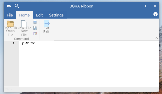
BGRA Ribbon Custom
How to create a fully themed window using the controls to achieve a Ribbon like application.
Tests
There are test for analog controls (clock and gauge), BC prefixed controls, BGRA prefixed controls, BGRA Custom Drawn controls, how to use Pascal Script and BGRABitmap, bgrascript or how to create your own scripting solution with BGRABitmap.
Tests Extra
These are extra tests like how to use fading effect, an fpGUI theme, games like maze and puzzle, how we created the material design animation, pix2svg or how to convert a small picture to svg using hexagons, rectangles and ellipses, plugins or how to load .dlls and use into a TBGRAVirtualScreen, rain effect, shadow effect, 9-slice-scaling with Custom Drawn or how to theme with bitmaps an application to look like Windows themes and 9-slice-scaling with charts.
Another units
These units come with BGRA Controls and contains more functionality that is sometimes used with the controls, sometimes not but are usefull in some way. Some are listed here, others you can see linked directly with any control like bcrtti, bcstylesform, bctools, bctypes.
Author: Dibo.
BCEffect
Fading effect with BGRABitmap.
Author: Lainz, Circular.
BCFilters
A set of pixel filters to use with BGRABitmap.
Author: Lainz.
BGRAScript
Scripting with BGRABitmap, see test project.
Author: Lainz.